Well my first midterm is tomorrow and I guess that means I'm halfway through my first semester of hell, although by the time I publish this it will be past midterms I'm sure. Law school has been interesting so far.I'm still wondering who I hoodwinked into letting me in. They said on our first day that some time during or first year we would wonder if we were smart enough to be in law school. Well that time came about the first day. Glad we got that out of the way. Actually it's not a new feeling, I spent much if three first year of my PhD thinking the same thing. Then I switched to my masters. Hmmm. I hope that isn't a sign of things to come. The good news is that I'm not the only one who feels this way. In fact many of the other 1L students have expressed the same feeling of inadequacy.
Law school has an interesting effect on you're periphery as well. I now "think like a lawyer" and I've devised ways to sue everyone I've ever met, friend and foe alike. I've also learned new cool Latin terms like Res ipsa loquitor and slip them into conversation quite regularly. The best part is that no one else has any clue what you just said so context is inconsequential.
Well anyway back to creativity. I spend most off my class periods on Pinterest lately searching for new fun projects, inspiration to steal and stalking those that I've blocked on face book. I came across a really cool idea the other day to merge text and a picture, but when I decided to try it the site wouldn't load the photo and I couldn't use a large file..
Well I don't have a pirated copy of Photoshop CS3 for nothing (and when I say pirated I mean I stole it from my mom until such time when she might actually want to use it). So here is a quick tutorial on how to do it.I should also point out that I'm not one for calling things by proper names so there will be a lot of "click this thingy" followed by screen shots and arrows. Ok, I'm writing this while I should be paying attention to public easements in property and I don't want the people behind me looking at me taking screen shots, so those may be added later. I would also do an action for it but I'm not that sophisticated.
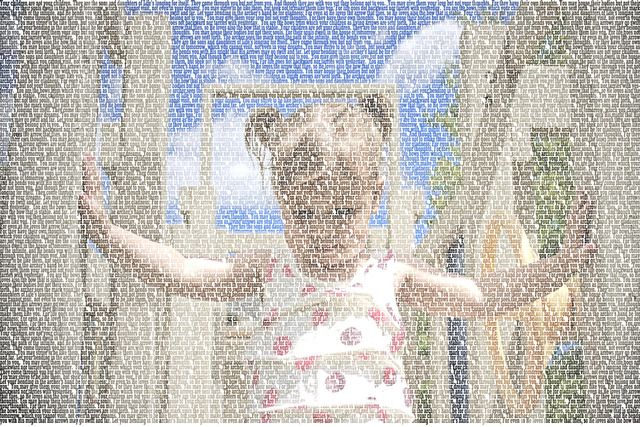
Well I played around and this is what I came up with at first...

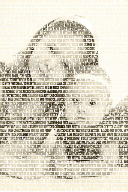
I tried converted this to black and white, but I was unimpressed by the amount of detail I got. But I think that it looks pretty decent in color. Also, this looks better when viewed smaller or from father away.So I tried another one that has less detail for sepia.
Law school has an interesting effect on you're periphery as well. I now "think like a lawyer" and I've devised ways to sue everyone I've ever met, friend and foe alike. I've also learned new cool Latin terms like Res ipsa loquitor and slip them into conversation quite regularly. The best part is that no one else has any clue what you just said so context is inconsequential.
Well anyway back to creativity. I spend most off my class periods on Pinterest lately searching for new fun projects, inspiration to steal and stalking those that I've blocked on face book. I came across a really cool idea the other day to merge text and a picture, but when I decided to try it the site wouldn't load the photo and I couldn't use a large file..
Well I don't have a pirated copy of Photoshop CS3 for nothing (and when I say pirated I mean I stole it from my mom until such time when she might actually want to use it). So here is a quick tutorial on how to do it.I should also point out that I'm not one for calling things by proper names so there will be a lot of "click this thingy" followed by screen shots and arrows. Ok, I'm writing this while I should be paying attention to public easements in property and I don't want the people behind me looking at me taking screen shots, so those may be added later. I would also do an action for it but I'm not that sophisticated.
Well I played around and this is what I came up with at first...

I tried converted this to black and white, but I was unimpressed by the amount of detail I got. But I think that it looks pretty decent in color. Also, this looks better when viewed smaller or from father away.So I tried another one that has less detail for sepia.

How to choose a picture
- choose a picture without much detail, it will get lost in the text and you won't be able to tell what it is.
- Use a large file, you want to be able to have options for the size of your text as well as wanting to keep the image crisp.
- Close ups of faces work well, get creative with cropping!
- You can use any font that you want, but keep in mind that you want your text to almost "meld" so some of the more flowery fonts will be unreadable by the time you edit the text.
- For a clearer picture, use a smaller font. Large fonts wash out the photograph
- Put only one space between sentences
- If you can't come up with enough text to fill the whole picture repeat it until you do.
- Consider all caps as in the black and white photo to achieve higher density.

No comments:
Post a Comment